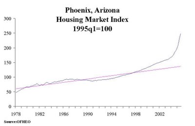
Thanks to http://overvalued.blogspot.com/ for doing this chart work for us.
Wow. A picture is worth 100000000000 words in this case.
Anyone care to argue that we're NOT in a bubble in Phoenix? Maybe quote the population inflow theory, talk about all the great jobs here, and how it's different this time?
Not.
Here's the commentary from the blogger. Thanks again!
This chart is by special request from Keith B, who runs a great blog called "Housing Panic: there goes the neighborhood". It can be found:http://housingpanic.blogspot.com
Sadly, Keith this chart is one of the ugliest I have come across. Price acceleration seems to have started in 1999, but something happened in 2003 and priced increased almost vertically. Prices are currently 81 percent above trend.
January 08, 2006
Here's the Phoenix housing bubble charted. Holy crap.
Posted by
blogger
at
1/08/2006
![]()
![]()
Subscribe to:
Post Comments (Atom)


9 comments:
Long term charts like that are misleading: they ought to be plotted on logarithmic y-axis.
5% per year inevitably generates an exponential growth and a visual "knee" in such a graph.
The fairest chart: deflated by the CPI deflator (or GDP deflator) and plotted on a semilog scale.
Even still I'm sure there's an obvious bubble.
If we take this data for Phoenix as given, with 1995=100 and my eyeballing 1978=50 and end of 2005=240, then 1978-1995 is compounding at ~4.0% and 1995-2006 is compounding at ~8.5%.
His graphs for Miami and Las Vegas are particularly interesting. They hug that straight line nearly perfectly for nearly 20 years (not an exponential increase) and then go straight up.
The theory that the change in the tax code in 1997 was the true start of this bubble gets some very compelling evidence from his collection of graphs.
drchaos makes important points. The other corrective method is to make the reversion to mean "line" the compounded "curve that it really is.
Third and I've discussed this elsewhere but can't recall excatly where is that the houses in places like PHX that have sold in the last three years are not the gouses of 1975, '85 or even '95. Bigger and more luxurious so the "median " house of today is not going to revert to 1975's 1200sq ft carport and swamp cooler on the roof median price.
Ah, the "hedonic adjustment". A buddy of mine and I have had a friendly philosophical back-and-forth for years over this.
He takes your position that you can't compare improved / fancied-up cars, computers, houses directly and therefore the adjustment is necessary and valid. Can't call that inflation.
My position is that I have to pay extra for a new 2 GHz processor even though it really is no improvement for me over the 500 MHz I'm using now, and I have to pay extra for that now-mandated airbag, which day-to-day does not improve my car in any way and (knock on wood) never will. Etc. (Note that I can buy a 500 MHz desktop at the computer surplus places but it's not new now.) So I'm paying more for what is essentially the same product -- clearly that is inflation, I say.
I will accept the "hedonic adjustment" if I can add that even if it is more expensive because it is nicer or bigger or whatever, there is no cheaper alternative and therefore it's still money out of my pocket and I now have less to spend on other stuff, need to raise my prices if I'm a business, etc.
so we can't compare historic costs for TV sets, computers or cars?
we can only compare historic costs for things like flour, or butter? Things that don't improve or change?
Here's Phoenix listing numbers -
6/30: xxxxx____6/05 sold: 11,545__6/04 sold: 11,665
7/20: 10,748
7/30: 11,656___7/05 sold: 10,200__7/04 sold: 8,525
8/10: 13,099
8/20: 14,321
8/30: 15,042___8/05 sold: 10,700__8/04 sold: 11,275
9/10: 16,716
9/20: 17,516
9/30: 18,799___9/05 sold: 9,815___9/04 sold: 7,780
10/10: 20,073
10/20: 21,806
10/30: 23,770__10/05 sold: 8,420__10/04 sold: 8,755
11/10: 25,387
11/20: 26,616
11/30: 26,811__11/05 sold: 7,195__11/04 sold: 9,525
12/10: 27,649
12/20: 27,580
12/30: 27,455
Population 2006:
Listing per population ratio 1/2:
1/2: 26,715
1/4: 27,125
1/6: 28,224
Keith B.
Just posted the Phoenix chart in logs. Nothing changes I'm afraid. Phoenix is suffering from a housing bubble. You can see that in logs, indices or US dollars.
returntodc
Stavo cercando pi� Info sul student self-assessment e sono venuto attraverso questo luogo.Deeply, Shanell student self-assessment
The hopes aren't so good. But I think that's a problem on the whole world.
Post a Comment